


As a frontend engineer, your daily work revolves around how to make a webpage better looking and hot to make them better responsive so that it can look beautiful at any screen size and at any screen ratio.
Most basic way to design any webpage
The most basic way to develop any webpage is to create an HTML file and then create the basic skeleton of any webpage and now link any basic CSS file to show styles to any webpage. Now the problem with this approach is that to make any website very stylish and to make it media responsive the raw CSS becomes very hard to maintain and very hard to design. So to make this job easier the rise of different frameworks becomes popular. hundreds of stylish libraries popped up to make designer life easier like bootstrap, Tailwind CSS, sass, Bulma, Sematic-UI and the list goes on. so let's see how these libraries make life easier. and let's take Tailwind CSS for demonstration
how to Integrate tailwindcss
using CDN
- CDN is a content delivery network that is distributed network for content distribution. the most basic and easy way to integrate is using CDN.to use this first create an index.html file and then use this
<!doctype html>
<html>
<head>
<meta charset="UTF-8">
<meta name="viewport" content="width=device-width, initial-scale=1.0">
<script src="https://cdn.tailwindcss.com"></script>
</head>
<body>
<h1 class="text-3xl font-bold underline">
 Hello world!
</h1>
</body>
</html>
using npm
- By using npm which is a package manager for node. The simplest and fastest way to get up and running with Tailwind CSS from scratch is with the Tailwind CLI tool.
npm install -D tailwindcss
npx tailwindcss init
main features of TailwindCSS
- utility first design
- the documentation describes it as Building complex components from a constrained set of primitive utilities. This means that a complex component is created using simple properties and simple features and by using simple modular blocks
-mobile design first
- Tailwind prefers a mobile-first design so if no screen size is not mentioned then the design first gets applied to mobile design and then if needed to change any design to other screens then use the screen size. let's understand it better using a simple example. so let's think you want to center a text at the center on a mobile screen but left on medium size screens
- the documentation describes it as Building complex components from a constrained set of primitive utilities. This means that a complex component is created using simple properties and simple features and by using simple modular blocks
-mobile design first
- By using npm which is a package manager for node. The simplest and fastest way to get up and running with Tailwind CSS from scratch is with the Tailwind CLI tool.
<div class="text-center sm:text-left"></div>
- focus hover and other states can be easily
<button class="bg-sky-500 hover:bg-sky-700 ...">
hello hello
</button>
Layout Features in TailwindCSS
- layout controls can be a very major thing to control using CSS by using grid or flexbox. this utility is for controlling the number of columns within an element.
so
by using column number
- columns-1 :this will contain one img in one cloumn div
- columns-2 :this will contain two img in one cloumn div
- columns-3 :this will contain three img in one cloumn div
<div class="columns-3 ...">
<img class="w-full aspect-video ..." src="..." />
<img class="w-full aspect-square ..." src="..." />
<!-- ... -->
</div>
by using column width
- another way to control layout is to give each div a min or max width and let it adjust according to the screen size and
<div class="columns-3xs ...">
<img class="w-full aspect-video ..." src="..." />
<img class="w-full aspect-square ..." src="..." />
<!-- ... -->
</div>
Display
control the div type and control the flow of the document and then assign flex and grid Use inline, inline-block, and block to control the flow of text and elements.
<div class="flex items-center">this will make the display flex. which by using a raw CSS will look something like
.taget_class{ display:flex; }<span class="inline">hello</span>this is one of the ways to control the flow of any div so we can make them block,inline-block, or inline just by using one line
Customizing Colors
black and white never look good in any webpage so it is always a good idea to use colors in any webpage now tailwind comes with a large collection of colors and a large variety of colors.
- so the most basic color is white and black and doesn't have any variant
but other colors like slate, grey, zinc, neutral, stone, red and blue have shades from 50 to 900
<h1 class="bg-green-200 text-red-400">hello world</h1>bg-color will change the background color and text-color will give colors to text items
- but sometimes the client requires you to give a custom color which he provides with hash code so to use the color in Tailwind CSS.there is two way one to configure the theme and next to use
<h1 class="bg-[#333] text-[#fff]">Custom color</h1>Spacing and Padding
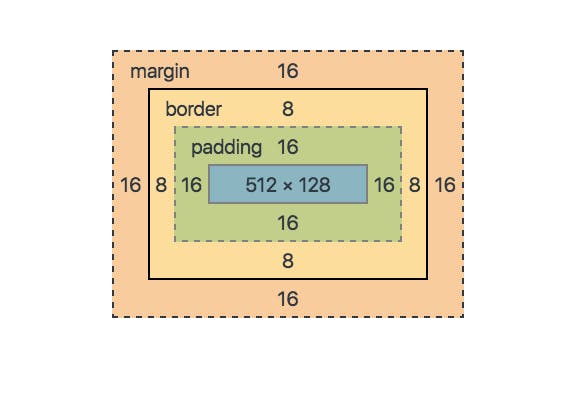
- flex and grids can align items in a container but to maintain spaces there are two ways margin and padding. The main difference between margin and padding is that margin gets applied outside the item and padding gets applied to the outside of the item. The box model can describe it better. the below picture will explain it better
- there are different ways to apply items like applying padding on all sides use
p-4it will apply a padding of 1 rem(0.25*4). but to apply padding to toppt-4and for left and right usepl-4andpr-4and will for margin usem-4and the configuration will be same for margin
Change Font Size
- font size can be easily changed used Tailwind CSS like
text-xs font-size: 0.75rem; /* 12px */ text-sm font-size: 0.875rem; /* 14px */ text-lg font-size: 1.125rem; /* 18px */ text-xl font-size: 1.25rem; /* 20px */ text-2xl font-size: 1.5rem; /* 24px */ ... text-9xl font-size: 8rem; /* 128px */<h1 class="text-2xl">hello world</h1>
This was a short and brief way to show how tailwind can be used and what advantage can it provide over using raw CSS. from my personal experience while creating large webpages I always prefer to use Tailwind CSS which makes my life much easier. Another CSS framework that is largely famous is Bootstrap(I personally dint like it because it controls too much and all the component looks generic )